Good design is the foundation of every successful business. Whether you are a freelancer, a startup, or an established South African company, understanding design basics will help you communicate your brand more effectively, attract the right clients, and build trust with your audience. Design is not a luxury reserved for big brands — it is a practical tool every business owner and creative professional can learn.
Core Design Principles Every Business Should Know
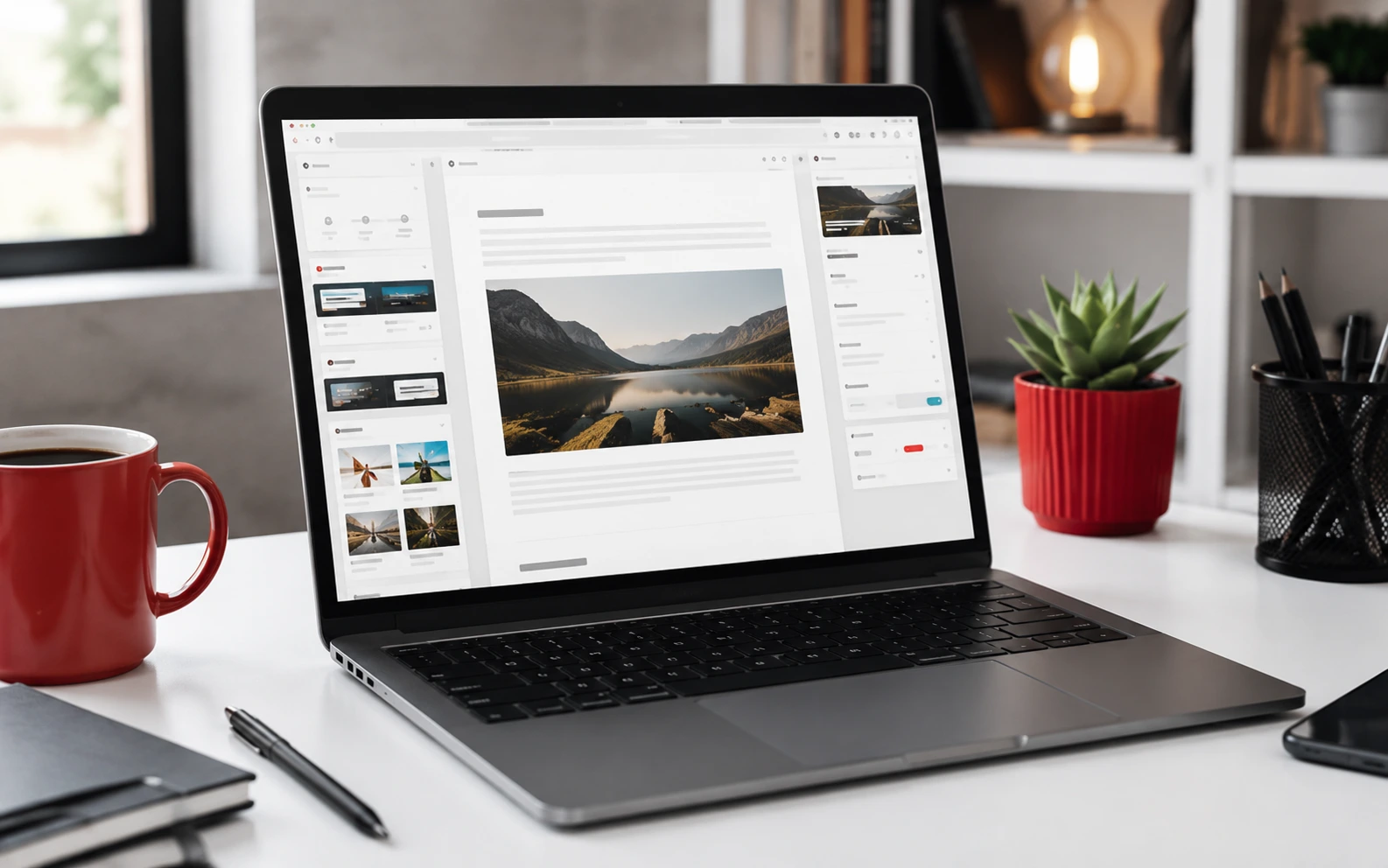
Design basics are the building blocks of all visual communication. These principles apply to your website, social media graphics, printed materials, and signage. Master them and every design decision becomes easier and more intentional.
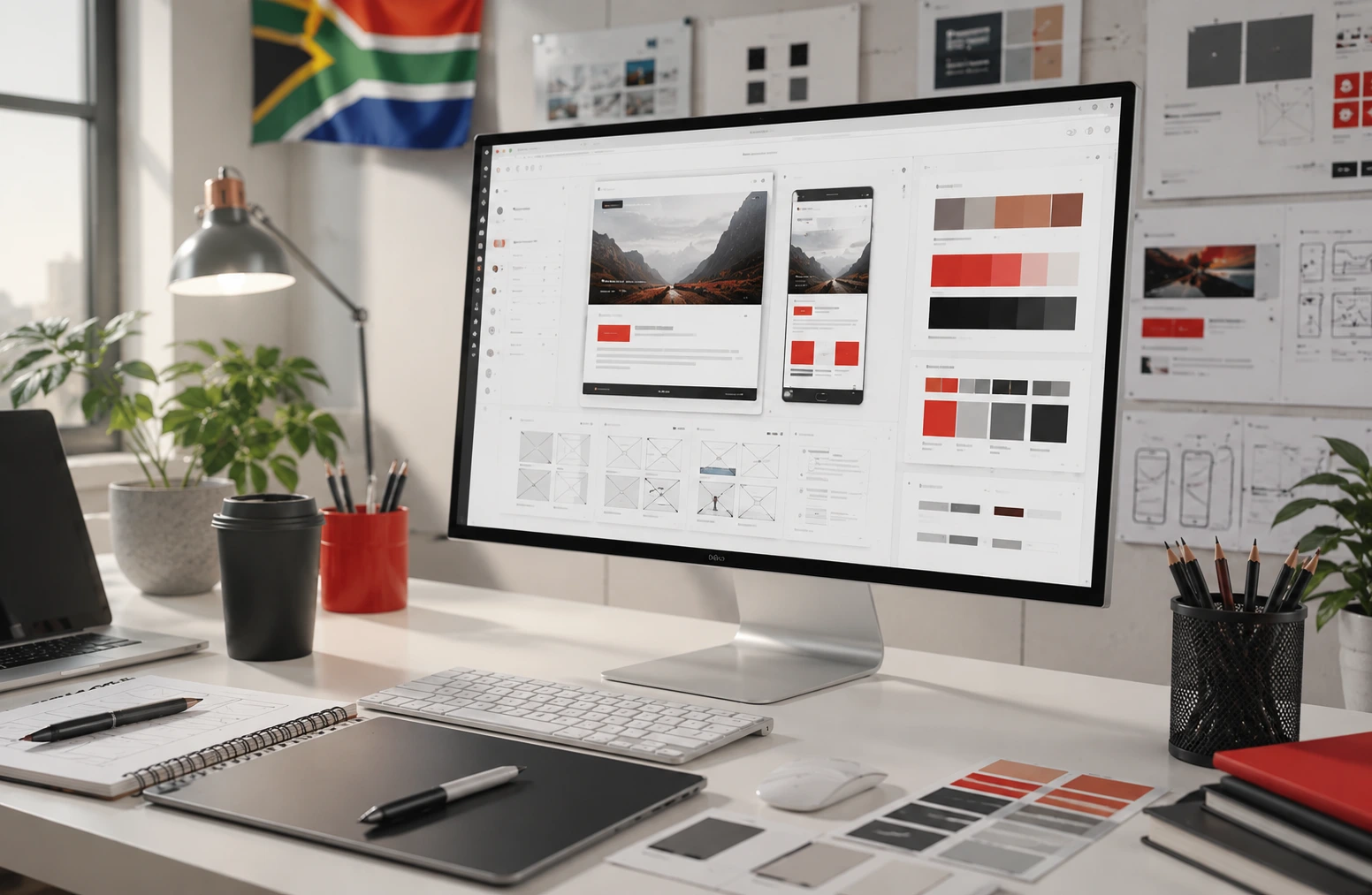
Colour is one of the most powerful tools in design. Choose a palette that reflects your brand personality and limit yourself to two or three primary colours with one or two accent shades. Consistency matters — using the same colours across all touchpoints builds recognition and professionalism. Before settling on a palette, test your colours together and check how they appear on screen and in print.
Typography shapes how your audience reads and feels about your content. Select one or two fonts that complement each other — typically a bold font for headings and a clean, readable font for body text. Avoid decorative typefaces for long paragraphs. Readability always wins over style. Make sure your chosen fonts are available in web-safe formats if you plan to use them on a website.
White space, also called negative space, is the breathing room around your design elements. Many beginners try to fill every corner, but white space actually focuses attention on what matters. It improves readability, creates a premium feel, and prevents your design from looking cluttered or overwhelming.
Visual hierarchy guides the eye through your layout. Use size, weight, colour contrast, and positioning to signal which elements are most important. Your headline should always dominate. Your call to action should be prominent and easy to find. Supporting information sits below or beside the primary message.
Applying Design Basics to Your South African Business
Understanding design basics is only useful when you apply them consistently. Here is how to put these principles to work for your business, whether you are in Cape Town, Johannesburg, or a smaller South African city.
Start with a simple brand style guide. This does not have to be a formal document. Even a one-page reference listing your logo versions, HEX colour codes, chosen fonts, and tone of voice will make a significant difference. A style guide ensures that every piece of content you create — whether in Canva, Photoshop, or a website builder — looks and feels like the same brand.
When designing your website, apply contrast deliberately. Make sure body text is legible against its background. Use your brand colours for buttons, headings, and accents rather than for entire page backgrounds. A clean, well-spaced layout will always outperform a busy one packed with competing elements.
For social media graphics, use consistent templates. Tools like Canva are ideal for South African small businesses and freelancers who need professional-looking graphics without a full design team. Stick to your brand fonts and colours, keep layouts simple, and always include your logo or business name.
When selecting images and photography, choose high-resolution visuals that match your brand tone. Free stock libraries like Unsplash and Pexels offer quality images suitable for most business uses. Avoid low-resolution images that appear blurry on modern screens — they undermine your credibility instantly.
Common Design Mistakes to Avoid
Even with the best intentions, many businesses make the same design mistakes repeatedly. Knowing what to avoid is just as valuable as knowing what to do.
Using too many fonts creates visual chaos. Two typefaces is the maximum for any professional design. More than that, and your materials begin to look amateur and disjointed.
Ignoring mobile design is a serious mistake in 2025. The majority of South African internet users browse on smartphones. Always check how your website and graphics display on smaller screens. Text must be large enough to read without zooming, and buttons must be big enough to tap comfortably.
Poor contrast makes your content difficult to read and excludes part of your audience. Light grey text on a white background may look minimal and modern, but it is inaccessible. Ensure that your body text has sufficient contrast against its background, particularly for older audiences or anyone viewing your content in bright sunlight.
By investing time in understanding and applying these design basics, any South African business owner or creative professional can build a stronger, more recognisable brand — without formal training. Start with the fundamentals, stay consistent, and refine your approach as your skills and business grow.